n8n Rebrands to Reflect Its Expanding AI Ambitions
The workflow automation platform has introduced a new logo, typeface, and refined color system as it expands its focus on AI agents and intelligent automation.
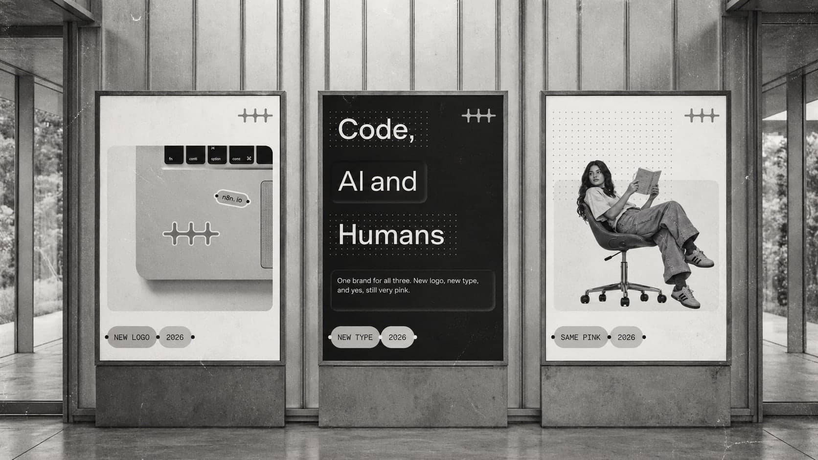
n8n has unveiled a refreshed brand identity designed to reflect its evolution from a workflow automation tool into a platform for building AI-powered systems. Announced at the In The Loop conference on October 14, 2026, the rebrand introduces a new logo, updated typography, and a refined visual identity centered on the company's signature pink.
In a blog post published on October 20, founder Jan Oberhauser explained the thinking behind the changes, pointing to the growing role of AI agents and autonomous processes in the n8n ecosystem.
A New Logo for a Changing Platform
The previous n8n logo was built around the concept of connected nodes, representing the platform's core function of linking tools and automating workflows. As the product has evolved, however, the company sees its role expanding beyond connecting systems.
Today, n8n enables users to build workflows in which AI agents take action, models interpret information, and data moves between systems in response to changing conditions. The new logo reflects this shift, emphasizing the activity and capabilities that connections enable rather than the connections themselves.
The rebrand also reflects n8n's ambitions to develop into a multi-product company, with AI agents becoming an increasingly central part of how users build and operate automated systems.
Typography and Color Reinforce the Brand
Alongside the logo, n8n has introduced a new typeface designed to balance technical precision with a more approachable character. The company aims to reflect both the technical nature of its platform and the people who use it to experiment, solve problems, and build new applications.
The brand's signature pink remains a central element of the visual identity, supported by a refined palette of gray tones. The updated color system gives the brand greater flexibility across its product interfaces, website, community platforms, and events.
What Remains Unchanged
Despite the visual changes, n8n says the rebrand builds on its existing identity rather than replacing it entirely. The company remains committed to its community, user flexibility, and control over how automation systems are built.
Its Community Edition and support for model choice also remain part of the platform's core principles. According to Oberhauser, the goal was to evolve the brand while preserving the values that have shaped n8n's development.
A Community-Informed Rebrand
The rebranding process involved contributors from across the company, alongside leadership feedback and input from selected community members who reviewed early design concepts.
The refreshed identity was unveiled at In The Loop on October 14 and is being introduced across n8n's product, website, community, and events.
The move reflects a broader challenge for technology companies as their products evolve. For n8n, the rebrand connects its visual identity with a strategic shift toward AI agents and more adaptive automation systems, positioning the company for its next stage of growth.
Source: n8n Blog